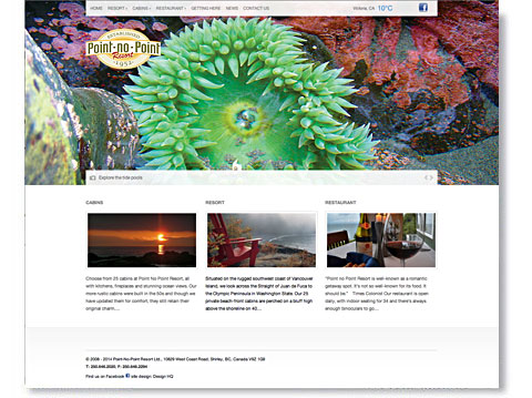
Years of photography were great resource for new website
![]()
Ian, I'm not a marketing guy, but I have to tell you those new cabin photos have made all the difference! Before you launched the new site, cabin 14 was the last to rent just because the photo didn't do it justice. Now it's booked solid and we could rent it 4 times over. Great job. Thanks for all your help.![]()
Challenge
Design a webite that evokes your experience at this unique resort on the rugged westcoast of Vancouver Island.
Solution
We started by visiting the site continuously for nearly 30 years. That gave us a pretty good feel for the place! Really though, it is undeniably our favourite escape and we (principals, children & nannies, friends, relatives & employees), have been going there since 1986. For the last decade or so, have helped this resort with design. When it came time to design their new website, there was not a nanosecond lost pondering what to do. We picked the best from our photo archives, told the story that needed telling and spent a few days shooting cabins .
The new site launched in February, 2014 and we're watching traffic climb steadily. The facebook group that we launched for them now has hundreds of members who are kind enough to answer each other's questions, share photos and rave about their favourite cabins. Thanks!
Since then the resort has expanded to include their new luxury accommodation — Bridge House at Point No Point. Four days stay and we had some great shots of the place, got back to the office and put together the companion site for this incredible new addition.
Work, work, work… what a grind!
