I love the concept. It really works for me! Great work.
Michelle Ninow, Regional Steering Committee on Homelessness
Challenge
2006 was the first time all communities within Greater Vancouver attempted a coordinated effort to raise awareness about the homelessness problem in British Columbia's lower mainland area. This region has the highest housing prices in Canada which perpetuates a constant erosion of affordable housing stock. One of our initial challenges was to develop the identity for Homelessness Awareness Week. The reasons for homelessness are complex — inadequate income; lack of support services in the community and a lack of affordable housing. If the identity focused on any one of these contributors, it would ignore the rest.
Solution
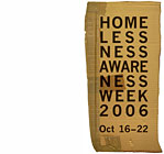
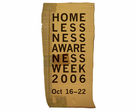
Regardless of the resons for homelessness, they result in unstable, temporary living arrangements. Corrugated cardboard suggested many aspects of the problem — from temporary street shelters or insulation from the cold, to constantly packing and moving belongings to the next available living arrangements.
We photographed the roughly cut corrugate with packing tape as the base for the identity. The no-nonsense, Franklin Gothic Bold typeface had the right degree of starkness. Stacking the sylables forced the reader to stop and study the identity to absorb its meaning.